We know that you’re interested in being ahead of the design curve, so we’ve laid out all of the trending home decor colors for 2023. Here are the colors of the year as chosen by some of the world’s leading paint companies – and how you can use them to give the right vibe to your space.
Darkroom, HGTV Home by Sherwin-Williams
Darkroom has been named Color of the Year by the HGTV Home by Sherwin-Williams collection. With rich purple undertones, it reminds one of the colors of a bare tree in winter, waiting patiently for spring.
How You Can Use It
If you’re looking to add some vibrancy to a space without loudness, Darkroom is an excellent choice. It’s subtle but also envelops a room in a cozy vibe. And as a neutral shade, it naturally accents the other shades in the Sherwin-Williams collection and can be used indoors and out.
Blank Canvas, Behr
Behr’s trending color selection for 2023 is Blank Canvas. As the name suggests, it evokes fresh starts and clean spaces. With this color in your starting palette, a room becomes a space ready for infinite possibilities.
How You Can Use It
This warm white goes with almost anything, so you can use it as a starting point or add a little bit of neutrality to an otherwise bright room. The great thing about this color is that you can mix and match it to your heart’s content!
Raspberry Blush, Benjamin Moore
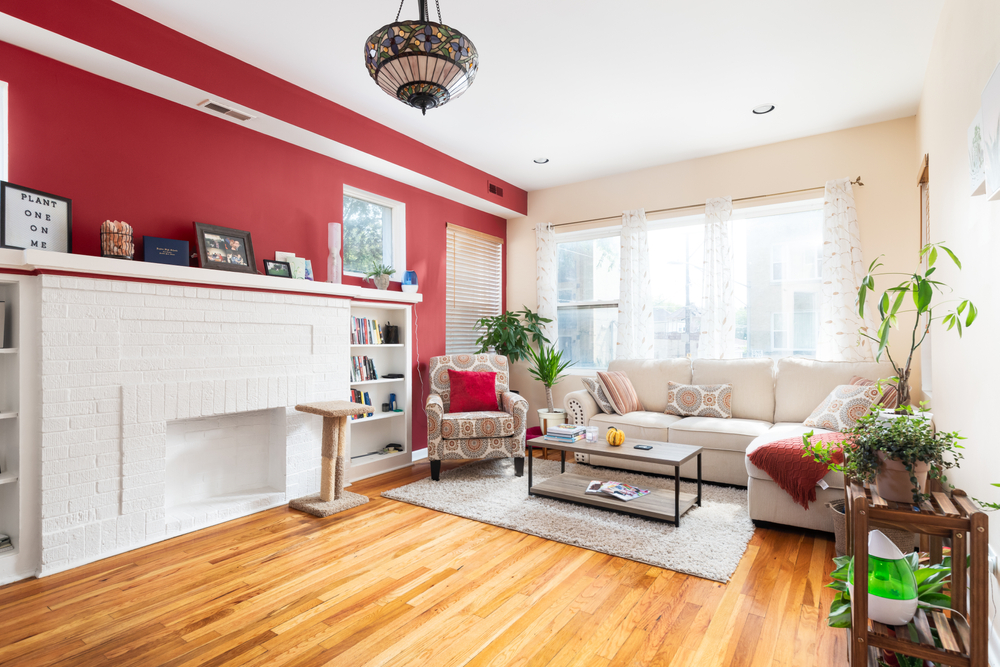
Benjamin Moore’s Raspberry Blush is a bold and inspiring color choice for anyone who wants to go big or go home. Adding this exciting red-orange hue to a space in your home could very well lead to other dramatic design decisions and may cascade into a whole new look!
How You Can Use It
This warm and vibrant hue makes for a perfect accent wall in an otherwise drab room. But if you’re not ready to go that far, a Raspberry Blush kitchen backsplash or a bar stool may be all you need for a nice pop of color.
Redend Point, Sherwin-Williams
The earthy pink-beige Redend Point by Sherwin-Williams is the neutral of the year. Softer than the trendy terracotta hues that preceded it in years past, Redend Point is an elegant addition to a room in need of some sprucing up.
How You Can Use It
The genius of this gorgeous blush-beige is that it’s flexible – you can neutralize a space for quiet and calm vibes or embolden it with black or brown pops of color – Darkroom, perhaps?
Viva Magenta, Pantone
According to Leatrice Eiseman, executive director of the Pantone Color Institute, “PANTONE 18-1750 Viva Magenta is inspired by the red of cochineal, one of the most precious dyes belonging to the natural dye family. Invoking the forces of nature, it galvanizes our spirit, helping us to build our inner strength.”
How You Can Use It
Viva Magenta could go either way – it pairs well with other warm reds and oranges, or it could provide a beautifully striking contrast to a deep blue or green.
Alizarin, Graham & Brown
Alizarin by Graham & Brown is a beautiful crimson shade named for the pigment traditionally used to make red dye. A subtle and sweet shade, it can add depth and warmth to any room in which it’s found.
How You Can Use It
A pop of this color in a reading or breakfast nook instantly takes you to a wonderful fantasy land. Use it for a space in your house that you want to be special or sacred.
Terra Rosa, Dunn-Edwards
Terra Rosa is another earthy pink hue trending this year, as the name suggests. But it is also more vibrant than the other beige-pinks we’ve seen so far.
How You Can Use It
Use this welcoming and warm hue in a space where people gather, like a living room, dining room, or kitchen, to make it more appealing and cozy for guests, friends, and family alike.
Spanish Moss, Krylon
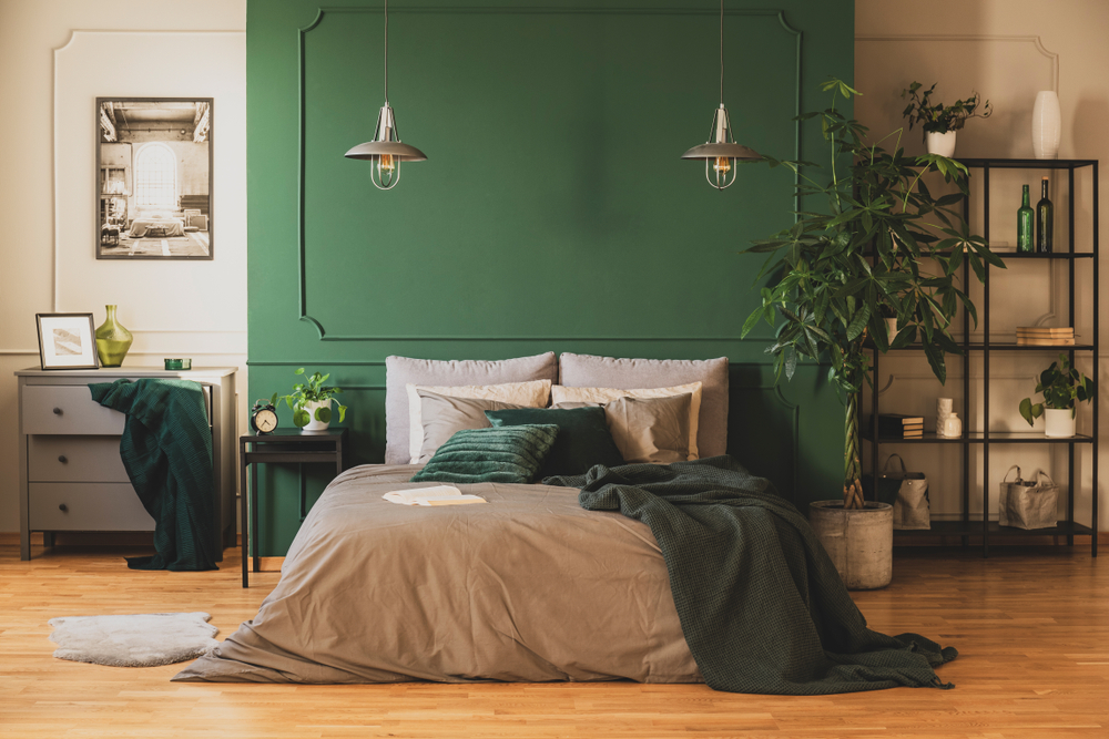
“This year’s color selection is inspired by the comfort and reassurance found in the past, as we look to find contentment in the future,” said Ashley Banbury, senior color designer for Krylon. “Spanish Moss is a timeless, organic hue that embraces the raw beauty of the natural world.”
How You Can Use It
This elegant green shade can shine in both indoor and outdoor spaces. Not only that, but it can balance warm or cool accents in a room. Accent a bookshelf or a cabinet for a little taste of a natural oasis right in your apartment.
Rustic Greige, Dutch Boy
A neutral grey-beige color with a slight red undertone, Dutch Boy’s trending color of the year is perfect for anyone looking for a fresh start in 2023. “It’s about retreating to a calmer, simpler lifestyle inspired by the peace and clarity of tones derived from nature,” said Ashley Banbury, NCIDQ and senior color designer of Dutch Boy Paints.
How You Can Use It
Rustic Greige is designed to look good after just one coat, so if you’re in a hurry to fix up a room (say, nesting last minute for an upcoming baby), this color will steer you right.
Request an Appointment with Diplomat Closet Design
It may be a challenge to choose the perfect colors for your home this year, but choosing your closet design company is easy. Diplomat Closet Design has storage solutions for your kitchen, garage, basement, and more. Request an appointment today with one of our designers to get started.
If you live in Delaware County in towns such as Wayne, Swarthmore or Havertown, contact us today.


